Why are infographics important? | Weboptim
As the internet has been used by millions of people to gather information, it has become increasingly challenging for businesses to communicate with people through their content.
Creating eye-catching and easy-to-understand content is no easy task. You have to dig deeper into the topic and find ways to present it in a way that outperforms the competition. We are not the only ones doing this, there are thousands of people who have the same goal. The challenge is how to make the content unique and engaging. This is where infographics come in. Infographics are visuals that convey information, data or insights.
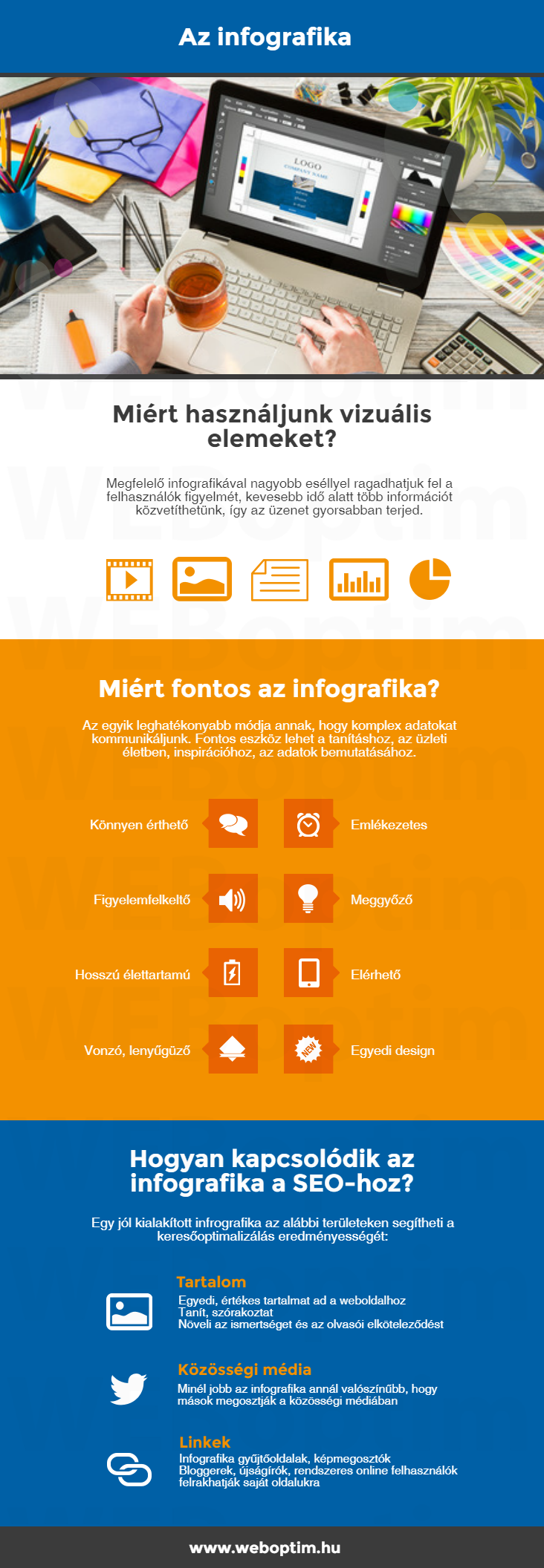
Why use visual elements?
What you can do with the text is quite limited. By using visual elements like infographics, we have a better chance of grabbing users' attention, conveying more information in less time, and getting the message across faster. Infographics complement text with visual elements, visuals require less time and mental effort.
People are forgetful. We lose everything from our keys to the URL of the product we want to buy. In contrast, infographics are sticky: adding relevant images to information can lead to a significant increase in attention.
It can be an important tool for teaching, for business, for inspiration, for presenting data. One of the most effective ways to communicate complex data.
Many people don't really know how useful infographics are, and think that graphs and tables alone are a good way to present data.
Let's look at why infographics are important!
Makes information more attractive
It's not just a bar chart or flowchart, but more than a combination of creative design and important information. Infographics can be used to present information in a more attractive way, with creative use of colours, lines and shapes to make it unique. Every infographic is different because each one is based on a different design.
Shows valuable ideas
Infographics are not just art, they are more than that. The information they try to deliver to people is more important than the colours we see. We may be impressed by the way it presents things, but what really impresses us is the information we can get from it.
Attention
The attractive design grabs your attention, you wonder what the lines, tables and graphs are. It might even be the images that make you turn your head. When we see them on a computer screen or in print, we are sure to look at them without knowing anything about them.
Easier to understand
Because the information is simplified, it is easier to understand. If we are happy to see data presented well in graphs and charts, we will be even happier to see it in a well-designed picture. Everything we want to say in one picture. You don't need to think for hours to understand long pages of data and figures because with infographics you can see them at a glance.
Breaks the monotony
Complex information is boring. Who will spend their time reading pages and pages of information? Who will spend a lot of time trying to understand complex numbers? Well, some people still do, but most people don't. It seems like a waste of time when you can actually present information in a simpler way through an infographic.
Available at
The internet is accessible to everyone, so it's easy to come across infographics. When we search, we use search engines, which provide both text and image results for our searches. Whatever tool we use, we can find it. We can even print it out.
Convincing
Its influence is more persuasive and stronger. Because it presents information in a unique way and is clearly laid out, it is easy to convince readers. Readers are less likely to doubt the data in this format. Of course, no one wastes their energy on designing an infographic that contains misleading information.
Memory
Bright colours, graphics and shapes make it easy to remember infographics. Remember, an image is easier to recall from memory. That's why television commercials are effective, visuals are the reason. Infographics have a similar effect.
Conveys information easily
The infographic makes it easy to convey information. It is harder to misinterpret because it represents facts and figures well. Data is often misleading, but that's where infographics are more so.
What is more than a simple picture or table?
Changing the font of the website may improve the readability of the post, but only to a limited extent. Sometimes we need a better strategy to keep the reader's attention - the power of infographics:
- the infographic immediately grabs readers' attention: A clean design can work wonders. Strive to use a well-matched colour palette, tasteful fonts, unique graphics and images, clear margins, and the right text-to-image ratio to have a big impact on memorability.
- infographics are a better solution for less exciting industries: boring, clichéd information can be made more interesting by presenting it in a non-traditional, more visual format.
- make it easier to explain things that are difficult to understand. If the words are too few, pictures can be more effective in presenting the whole picture.
- the infographics often show feelings and widespread belief that the art of persuasion evokes strong emotions in the audience.
- the infographic more likely to spread. The high readability and visual appeal makes it accessible to a wider range of people and therefore more likely to be shared.
- the infographics have a longer lifespan. A good infographic will be shared again, even years later.
- with the infographic reach a wider audience. Creating content exclusively for your target audience can sometimes limit your online visibility. Reaching people who are not interested in the product/service is unlikely to increase sales, but it will improve online visibility and indirectly help you reach your target audience.
Why are infographics essential for a successful SEO campaign?
We live in an age of information overload. We've learned to review the key points of an article or blog post, and if we find them too complicated, confusing or too long, we leave the page. To stay competitive, we need to adapt to the changing digital world.
How are infographics related to SEO?
As SEO grows, it now involves much more than page modifications and generic inbound links. Factors such as bounce rate, time on page and quality of inbound links are now important to pay close attention to.
Key areas of an SEO campaign:
- on-site 'tuning' and optimisation
- creating unique, quality content
- obtaining relevant links
- developing a strong social media presence
A successful SEO campaign can have the following positive results:
- increasing website traffic
- increase in the number of relevant links
- increasing social media engagement
- increase in leads and conversions
- increasing brand awareness
- growing reputation
What does the infographic have to do with all this?
A masterfully designed infographic can help your SEO campaign on 3 out of 4 key points:
- Content: the infographic adds unique, valuable content to the website. They educate, entertain, increase awareness and reader engagement.
- social media: the better the infographic the more likely it is to be shared on social media
- links: if readers start talking about infographics, bloggers, journalists, regular online users are more likely to want to talk about them in more depth. They may decide to post it on their own site or share their views on the subject.
So with infographics, you get three for the price of one. It can help you achieve your SEO campaign goals and drive more traffic, brand awareness, more conversions and more leads.
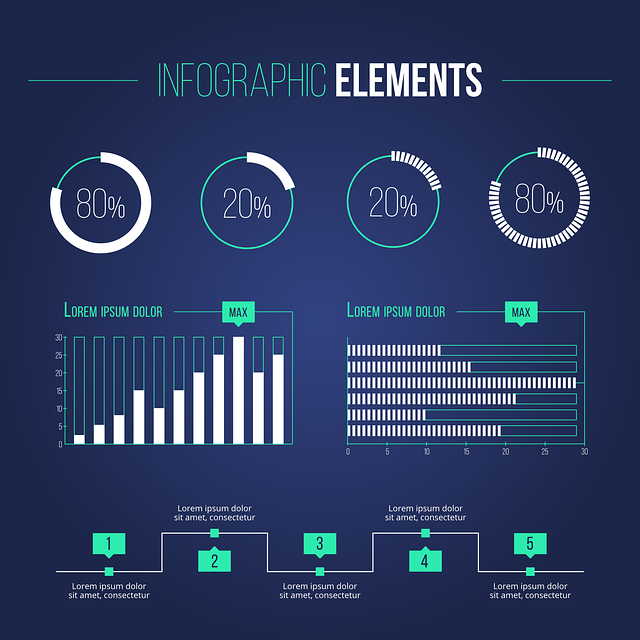
Below is an example of an infographic... how much more attractive is it than the plain text version above? : )
Source: naldzgraphics.net ; pictochart.com/blog