What does a good landing page look like? | Weboptim
The landing page is the page that the visitor arrives at after clicking on our online ad. As this is the first page they encounter, it is very important to know what this page looks like, as it is here that they will decide whether to stay with us or continue their search. That's why you shouldn't direct them to our homepage, because they will find a lot of unnecessary information there, which will distract them. The point of a landing page is to direct attention to what made him click on our ad.
In the following, we will show how this can be achieved.
1. The fewer the distractions, the greater the conversion rate- the percentage of shoppers (or visitors performing the desired action) and visitors in a given period. Focus on the call-to-action (CTA) button (the button on the website that prompts the visitor to take action: e.g. subscribe, download, order, etc.), not on other information or images that distract the visitor.
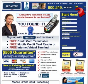
This is a typically bad, overcrowded site:
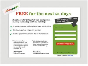
Here the aim is clear:
Isn't it so much better to focus on one thing and not get distracted by others?
2. The larger the consistency between the ad and the clicked page, the greater the chance that the visitor will feel that they have come to the right place and will stay as a result. Match the message of the ad with the page and, in the case of a display ad, the design.
3. A context is one of the most powerful ways to create an "experience" in the visitor that will make them a customer. Make them feel that what you are saying is for them personally: start communicating before the click and continue after the click.
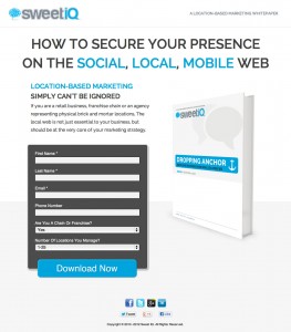
4. On the landig page form-also has an important role to play. In order not to scare the visitor away, a few rules should be followed: not too long, not too many questions that the visitor has to type in, and a drop-down menu with an "Other" option.
It's not long, just asks for the essential information: it's a good form.
5. The text on the page plays a key role in the success of the campaign: in particular the corresponding address and the text of the CTA button (to get you to click), we need to pay close attention.
6. Do not be on the page, but mostly near the CTA button words of deterrence, such as "spam", "trick", etc., since the context of these words may not be read by the visitor and they may be intrinsically discouraging, even if they are intended to be positive.
7. A designmore than a visual solution: you need to create an experience that draws attention to the purpose of the page.
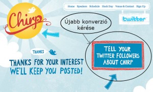
8. On the confirmation, thank you page, always ask for a another conversion. For example: 'Thank you for registering on our site! If you would like to receive our latest promotions, please subscribe to our newsletter."
Welcome page after filling in the form:
9. We can use more CTA button on the page in case they all have the same purpose.
10. Finally, let's go all the way from the ad to our Landig page and give an honest opinion.
Source: moz.com


